Totally different to “NIÑO VIEJO”, this time the restaurant was a Showcooking Teppanyaki one.
The main problem was the length of the available space. Being as it was a Japanese restaurant, I thought that turning its right white wall into a bullet train would be appropriate.
After creating the designs, with a manga touch, we translated them on the wall.
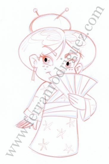
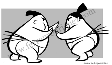
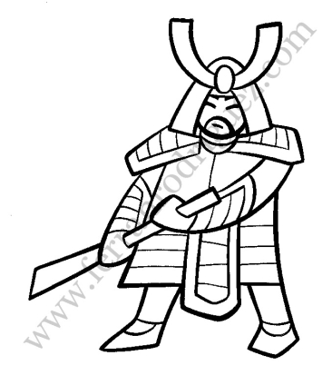
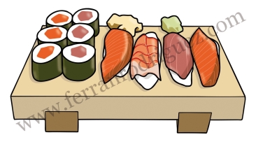
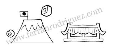
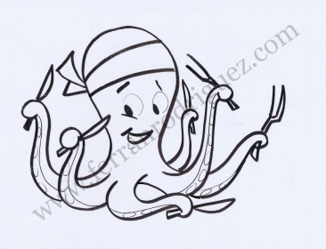
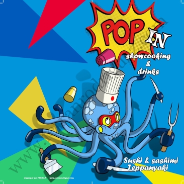
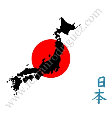
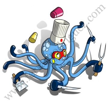
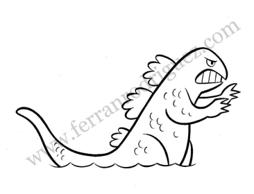
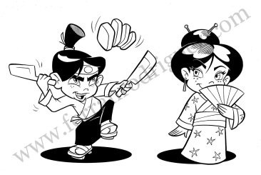
Here you’ll find some photos of the process and also some of the single elements I designed to be incorporated as a vinyl.
The pack would be completed once small tables and seats were placed along the drawed windows.




 English
 Català
 Español